Creating a peaceful and relaxing atmosphere in your home starts with the right choice of colors. Calm colors can transform any space into a sanctuary where you can unwind and recharge. But how do you choose the best calming hues for your home? In this post, we’ll explore practical tips and ideas to help you select soothing colors that bring tranquility and balance to your living environment.
Why Choose Calm Colors?
Colors affect our mood and perception in profound ways. Bright and intense colors can be energizing but may also feel overwhelming if overused. Calm colors, on the other hand, evoke a sense of comfort, peace, and stability. They create a welcoming environment that reduces stress and helps you relax, whether it’s in a living room, bedroom, or even a home office.
Popular Calm Colors and Their Effects
Before diving into tips, it helps to know which colors are generally considered calming:
– Soft Blues: Blue tones remind us of the sky and water, often linked to serenity and clarity.
– Muted Greens: Green symbolizes nature and growth, promoting harmony and balance.
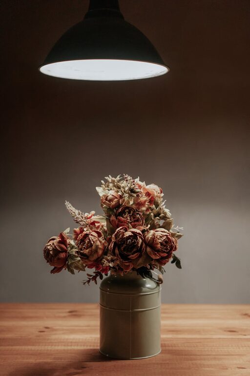
– Warm Neutrals: Shades like beige, taupe, and warm gray are subtle yet inviting.
– Pastel Purples: Light lavenders create a sense of luxury without feeling overwhelming.
– Pale Pinks: Soft pinks add warmth and tenderness without being too vibrant.
Keep in mind that the shade and saturation impact how calming a color feels. Lighter, muted tones are usually more peaceful than bright, saturated ones.
Tips for Choosing Calm Colors for Your Home
1. Start with Your Lighting
Lighting plays a major role in how color appears in a space. Natural light enhances subtle shades, making them look vibrant yet calm. Artificial lighting, whether cool or warm, can change a color’s mood drastically.
Tip: Test paint samples on your walls and observe them at different times of day to see how natural and artificial light affect the colors.
2. Choose a Base Color and Build From There
Begin by picking one main calming color as your base, then complement it with secondary and accent hues. This creates harmony and prevents the space from feeling chaotic.
For example, soft blue walls paired with warm neutrals in furniture and decorative pieces create a relaxing blend.
3. Use Color to Define Spaces
Calm colors don’t have to be limited to walls. You can introduce them through textiles such as curtains, rugs, cushions, and bedding. This method allows more flexibility if you want to change your décor later.
Tip: Use calm colors for larger areas and brighten up smaller accents with more vivid hues if desired.
4. Consider the Purpose of Each Room
Different rooms serve different functions, so tailor your color choices accordingly:
– Bedroom: Soft blues, pale greens, or muted purples encourage restfulness.
– Living Room: Warm neutrals mixed with blue or green create an inviting atmosphere.
– Home Office: Calm but slightly energizing colors like soft teal or light gray boost concentration without causing stress.
– Bathroom: Light blues and greens evoke freshness and cleanliness.
5. Stick to a Consistent Palette
Keeping your entire home’s palette within a similar range of calm colors helps create a cohesive look. Choose 2-3 main calm colors and repeat them in different rooms to tie everything together.
6. Pay Attention to Undertones
Colors have undertones—subtle hints of other shades beneath the main hue. For example, a beige with yellow undertones feels warmer, whereas one with gray undertones feels cooler and more neutral.
Understanding undertones helps in pairing colors together and achieving the calm look you want. If possible, bring swatches home or consult with experts to find undertones that suit your space and lighting.
7. Use Texture and Materials to Enhance Calm Colors
Combining calm colors with natural textures like wood, linen, or woven fabrics adds depth and coziness. Soft fabrics and organic materials work perfectly with muted and pastel hues, making your home feel warm and inviting.
8. Avoid Overwhelming with Too Many Colors
Stick to simple and well-balanced color schemes. Too many colors in a room can create visual noise, which contradicts the goal of calmness.
Rule of thumb: Use no more than three dominant colors per room, and use accents sparingly.
Final Thoughts
Choosing calm colors for your home doesn’t have to be daunting. With thoughtful planning and a bit of experimentation, you can create a space that feels serene and welcoming. Remember to consider lighting, room function, and your personal preferences. Calm colors will help you craft a peaceful sanctuary where you enjoy spending time day after day.
Ready to start your calming color makeover? Pick your favorite soothing shade, test it out, and watch your home transform into a place of relaxation and comfort!